Bittermann Photography
March 14, 2012
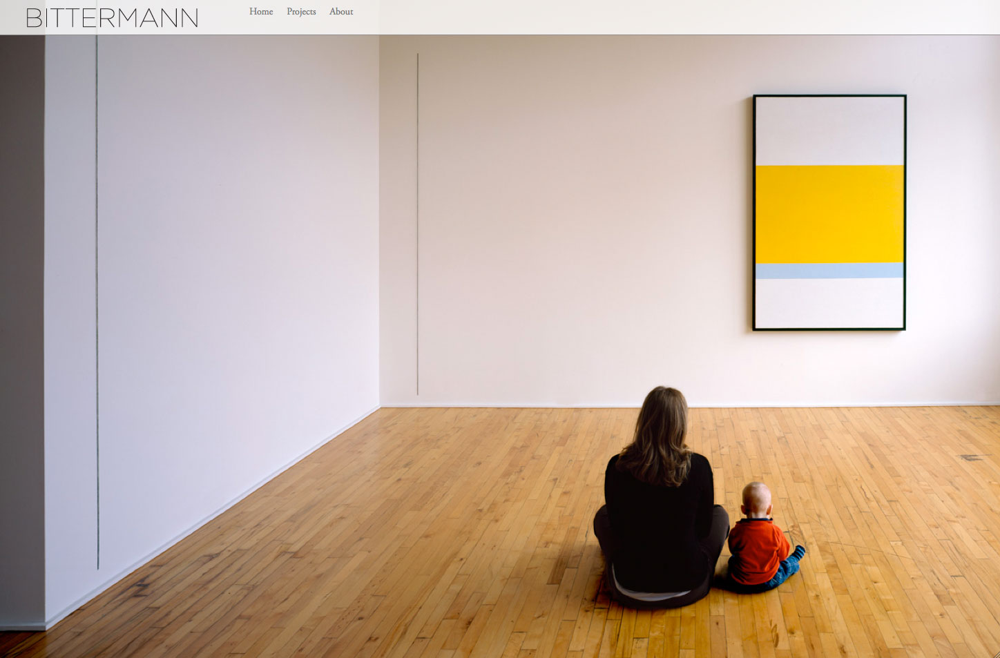
 Take a look at this site that Harmonic Northwest developed recently for Jeremy Bittermann:
https://www.bittermannphotography.com
It’s the first site I’ve put together with the iPad as the primary target platform. That meant making use of swipe gestures, avoiding touch-unfriendly actions and making the general shape and size of the site iPad-optimized. We also wanted to have the images (which are really the focus of the site) take up as many onscreen pixels as possible. So that meant having the whole page be responsive to current size of the browser window and dynamically changing with browser resizing or rotating (in the case of tablet/mobile device).
It was a lot of work, but I think it turned out rather nice in the end. Everything shrinks and grows fluidly with screen size. Probably the area where the dynamic sizing helps the most are the project slideshows. The slideshow image is always a big as it can be within the browser window and within the framework of the design elements without any cropping or adjustment of the aspect ratio. The effect is enhanced on iOS by the ability to swipe through photos rather than using the arrows.
 All of this was done in WordPress, by the way, making it pretty easy for Jeremy to go in and add/edit his portfolios. He can use the WYSIWYG editor to drag and drop images to change their order or to add/remove photos. The captions are set in the description text associated with an image in the Media Library. The images in the background of the home page have their own special page in WordPress where they can be edited in the same fashion as the slideshow photos.
Design credit on this one goes to Josh at Plazm, who provided these very clean, very user-friendly page layouts.


