Accelrys responsive microsite
June 15, 2012
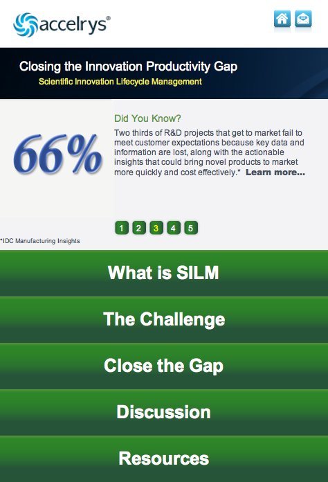
 I developed this microsite with Mambo Media for Accelrys:
Accelrys Scientific Innovation Lifecycle Management
The neat part about this site is the responsiveness. The site uses the same HTML code but completely different layouts for desktop and mobile screens. That functionality is dependent on the width of the browser screen, so you can actually see the mobile site in action on your desktop browser by making the browser window really skinny. Note that the carousel works in both layout modes.
More from the Blog


