
Bringing Elegance to a Complex UI
January 14th, 2016 by Gage Pacifera
Rethinking the user interface for an existing application can be a challenging task. Unlike creating an application from scratch, there are already existing functionality paradigms and a big part of the job is figuring out which ones are working well and should be preserved and which ones should be reassessed and improved.
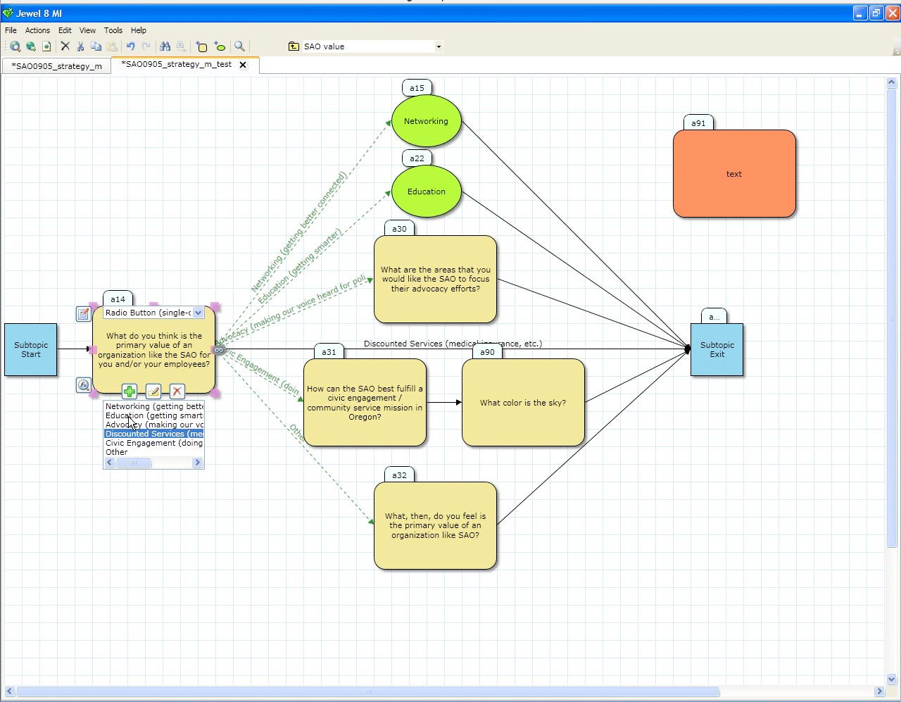 Fuse Insight approached Harmonic Northwest to improve the UI for their Jewel questionnaire software that was already quite functional. Their back-end team had done a great job of putting together a visually-intuitive experience that allows users to handcraft sophisticated multi-path questionnaires. But there was definitely room for improvement: there was a fair amount of onscreen clutter, many of the important interactions were unintuitive and hard to find and the simplistic graphic design felt a bit underwhelming.
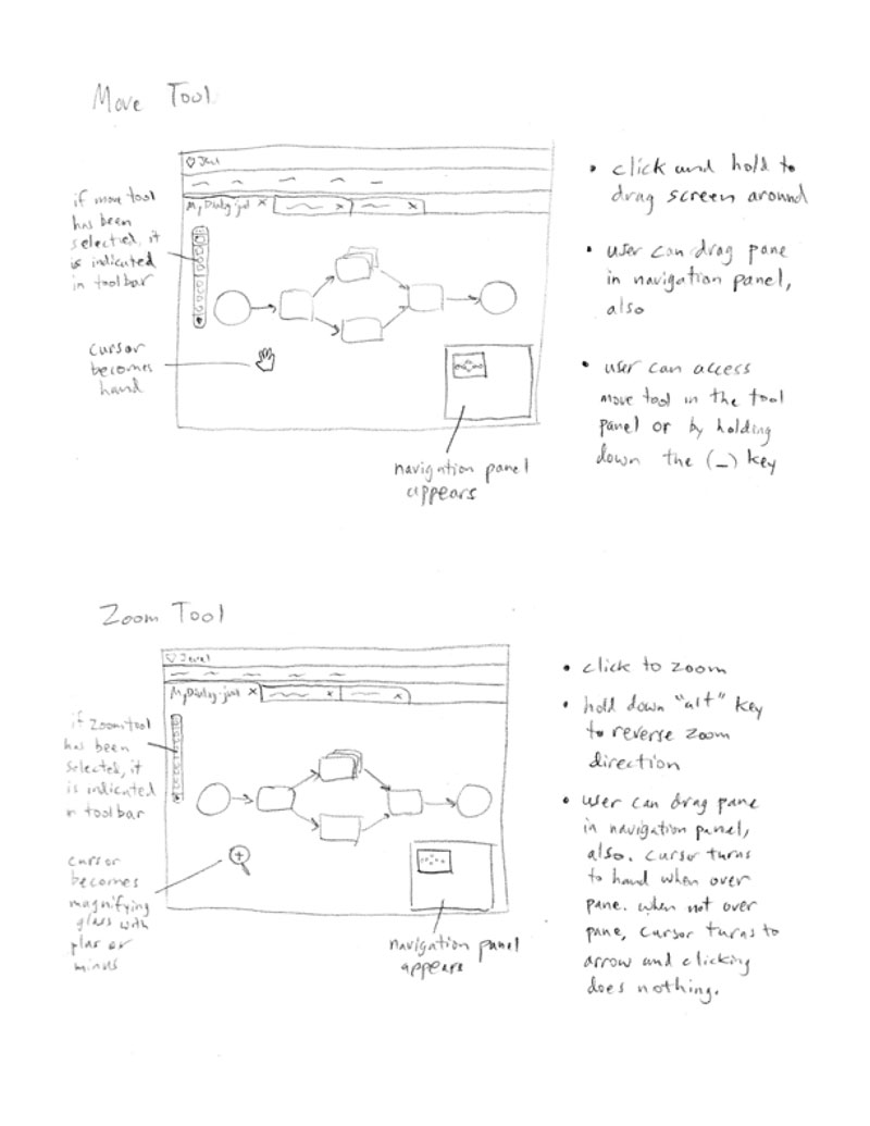 I started the project with my two most indispensable tools for doing UI work: pencil and paper. I performed an app audit to note existing app functionality and began sketching out ideas for improving the user interface including drag-and-drop interactions, toolbars, menus, keyboard commands and modal boxes. After couple rounds of compiling and presenting these annotated sketches, we arrived at a several-page-long PDF document that outlined the functional changes we were interested in exploring.
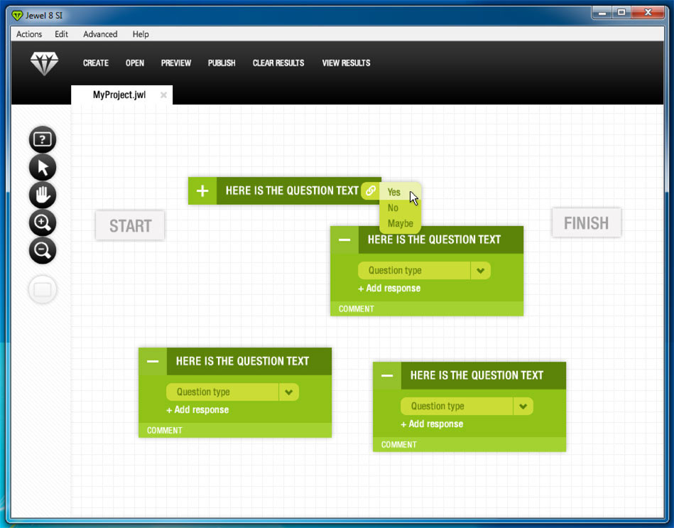 The next phase of the project was spearheaded by UX and graphic designer extraordinaire Mike Fofrich. He was able use the sketches as a reference for creating his vision of the user interface. The first round of designs he produced were fantastic: they brought a modernized, super-intuitive experience to the app. The options were simplified, the content was easy to edit and the whole package was quite elegant.
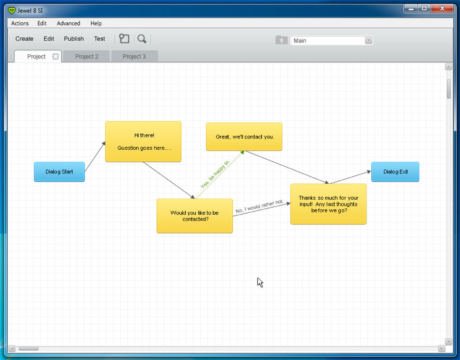 Unfortunately, it was going to be too big of a lift on the development end of the project to bring Mike’s original vision to life. We ended up scaling back the changes and simply created a new skin for the original application that left the existing functionality largely in place. It was rough having to scrap that initial work that we had put in, but in the end we did succeed in making a big improvement to the app interface and were able to deliver a new design to the Jewel development team that they were able to implement without too much difficulty. I was happy to file the project under “All’s well that ends well.”
For another example of Harmonic Northwest rethinking an existing app user interface, check out this blog entry summing up the Prospector UI redesign.