A Nice Little Mobile-First Site
February 5, 2013

 I recently put up a cool little web site for one of my clients. It’s the first site that I’ve done with a “mobile first” approach, meaning that my primary concern was optimizing the user experience for smaller-screen mobile devices. The site turned out great and I learned a few new tricks.. see details below. The content is restricted to registered users, so I can’t show off the live version, but you can check out some of the screenshots I’ve posted here.
One Layout to Rule Them All
(note: it’s possible that I’m kind of excited about The Hobbit right now)
I don’t know if this site actually qualifies as “responsive” because almost all of the same CSS is being applied to all versions of the site. I did make a few small layout changes based on screen size (like some font sizes and some spacing) but by and large users see the exact same code and the exact same content on both small and large screens. The site was designed in such a way that we didn’t need to make any significant changes to the layout based on screen size. I used percentage widths and em units wherever possible and set pixel-based maximum widths on content containers.
The Design
The design was done by local designer Sze Wa Cheung. She did a great job creating an elegant, simple design that works well on mobile as well as desktop. She made my job of coding up the layout really easy. When we were discussing the design for this project, I mentioned that typography and spacing are key for mobile sites, and she did a really excellent job with those elements. She’s a recent PSU grad and does freelance work, btw.
Navigation
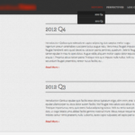
 There are a couple levels of navigation on the site. There is a top menu that has a listing of reports (the main content of the site) and also a listing of auxillary materials. The menu is a dropdown menu and I have mixed feelings about dropdowns on mobile sites. While dropdown menus are great for conserving precious screen space, one doesn’t necessarily expect to see a dropdown on a mobile device (users expect simpler navigation on mobile) and the interaction is complex enough that it can cause usability issues. But here we rolled with it and I think it does work pretty well.
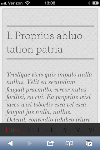
Another level of navigation is an intra-page navigation bar that affixes itself to the bottom of the browser window. The links in this bar jump to the various sections of the page. A couple things I’m proud of here:
- The links (and also the section breaks, for that matter) are generated dynamically based on the <h1> headings in the page, so no need to hard-code this menu on a page-by-page basis
- When you click on a link, you get a cool animated scrolling effect that brings you to the link target. I happen to think this is awesome.
- The link titles change based on screen width. If the screen is wide enough and the section titles short enough, you’ll get to see the full titles of the section. If not, then those links get condensed down to roman numerals.
Dynamic Hide/Show
Another feature we implemented as part of our mobile first approach is initially hiding content that appears in the various sections until the user chooses to show it. Without this feature, a mobile user might tire of scrolling and never scroll down enough to see all of the section titles. By initially hiding the content and just showing a heading and description, the user can quickly grasp all sections of a page and once informed of that, can choose which to read.
Registered Users Only
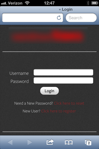
 The other interesting part of this site is that it needed to have a system for registering and doing access control for subscribers. For this functionality I used the WordPress plugin WP-Members (more on that plugin here). It fit the bill: we were able to add user sign up forms, allow users to log in, change their account info, reset password, and have new user registrations be approved or disapproved by admins using a fairly intuitive UI. Site administrators and subscribers get email notifications at various key points of that process.


